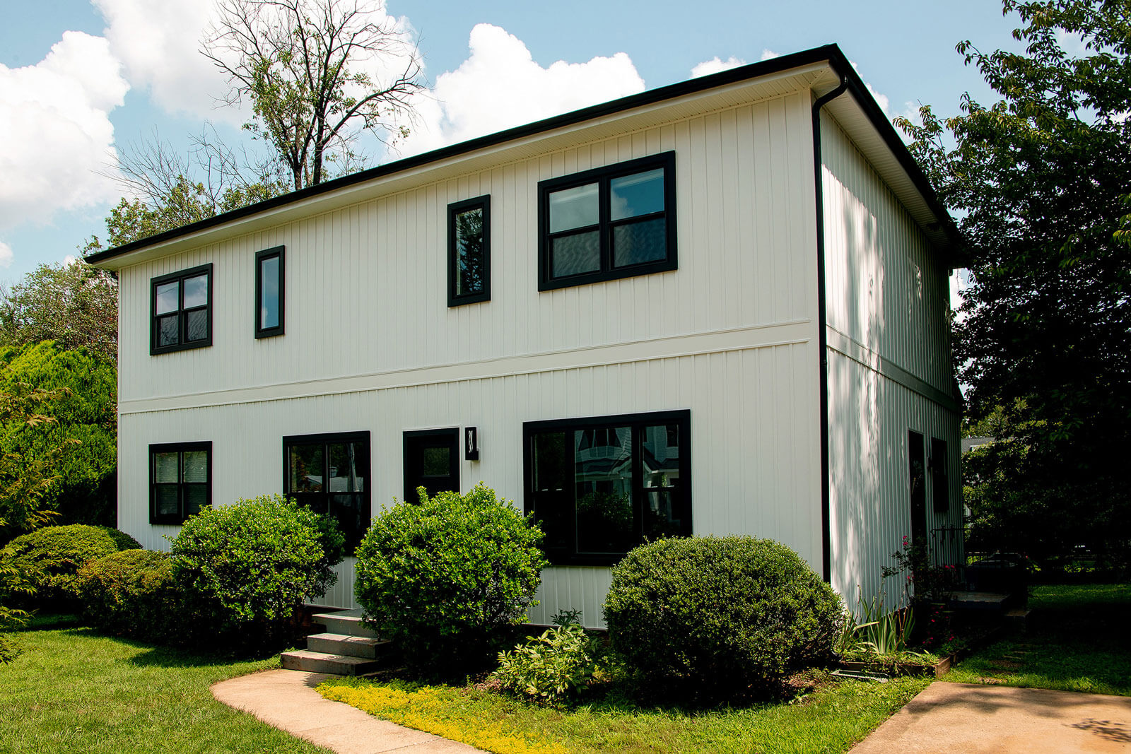
Color is a mood-setting tool used for everything from restaurant branding and clothing design, to home ambiance. As designers collaborating with your remodeling dreams, it’s our job to keep up with the latest color trends and help bring your vision to life through pigments, hues, shades and impactful coloration.
If you’re a lover of color, check out this years top colors of the year to inspire the rooms you’re making anew.
Pantone’s 2016 Color(s) of the Year:

Rose Quartz and Serenity
Joined together Rose Quartz and Serenity demonstrate an inherent balance between a warmer embracing rose tone and the cooler tranquil blue, reflecting connection and wellness as well as a soothing sense of order and peace.
-Leatrice Eiseman, Executive Director
Pantone Color Institute®
Here are some ideas for using Rose Quartz and Serenity in your home.
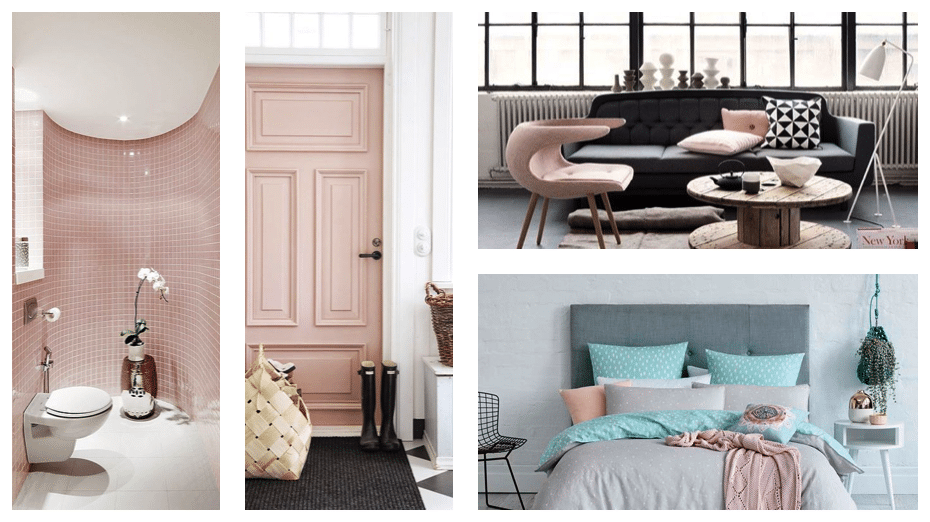
Rose Quartz
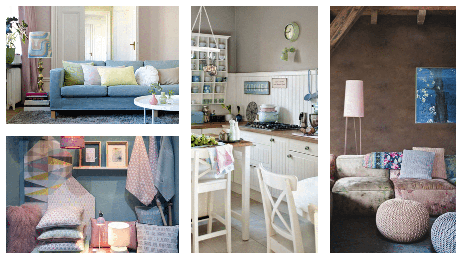
Serenity
Benjamin Moore Color of the Year:
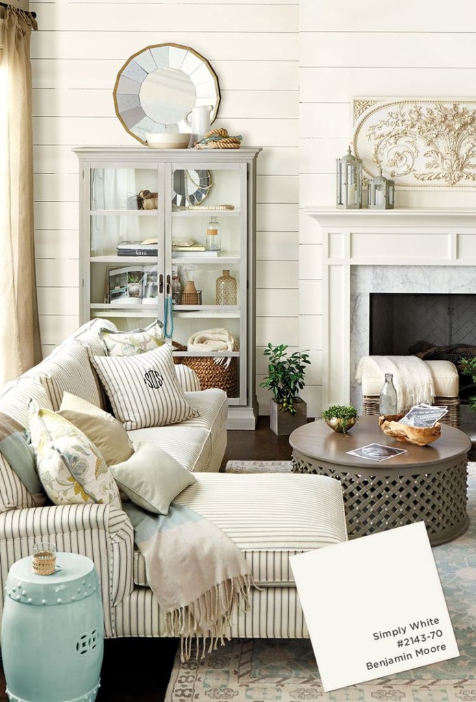
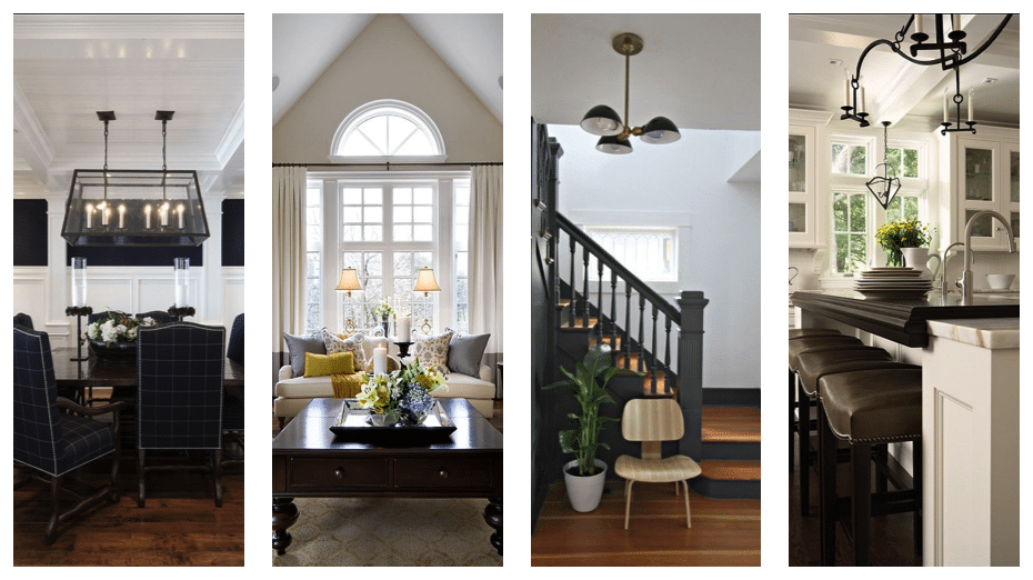
Simply White
“The interplay of whites and light creates nuance and subtle beauty.”
“Angles and edges become sharply defined as white is cut with black.”
Coats of white paint refresh rustic boards and beams and take on a warm, soft glow.”
-Benjamine Moore
Simply White
Color Marketing Group January Color Alert:
Uni Blue
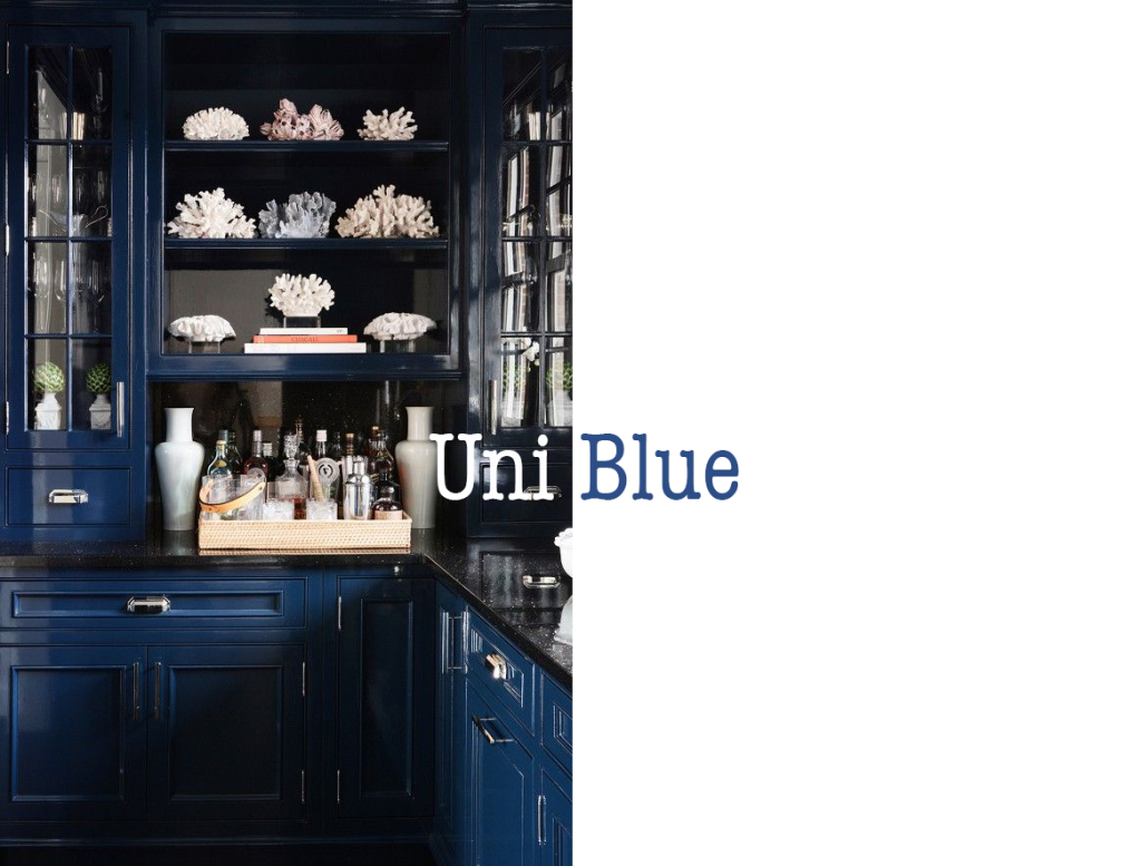
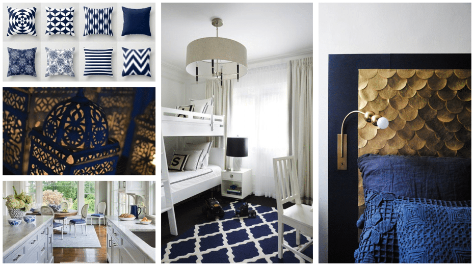
“A deep, chromatic blue, Uni Blue transitions from cobalt to near-navy, providing a meaningful color that anyone can embrace. It is part of a color continuum that connects spaces, people and ideas, in life and in color.”
-Color Marketing Group
Uni Blue
Sherwin Williams Color of the Year:
Alabaster
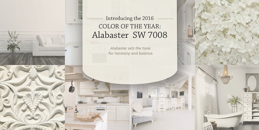
“Alabaster represents a straightforward and necessary shift to mindfulness. It provides an oasis of calmness, spirituality and ‘less is more’ visual relief. Alabaster is neither stark nor overly warm, but rather an understated and alluring white.”
-Jackie Jordan, Sherwin-Williams
Director of Color Marketing
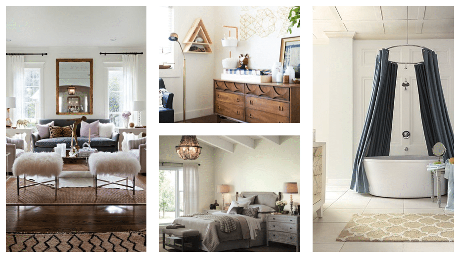
Alabaster

