As a designer I have a plethora of options when it comes to choosing paint; time after time I go back to Sherwin-Williams. Every year Sherwin-Williams does a color preview called Colormix. Colormix displays four sets of palettes intended to forecast design and color trends in the coming year.
Colormix 2017 left me feeling baffled. Usually I can choose one of the palettes that I feel expresses my own personal style and is most like me. With next year’s Colormix forecast I found that I relate to all four palettes in completely different ways.
In the Washington DC area, we don’t typically latch on to style trends–at least not right away. That’s not a bad thing, we just have our own style that is classic and timeless. By and large, most of the homes in this area are colonial so there is a lot of traditional and transitional design.
That said, there are many ways that we can incorporate style trends into the home by adding furnishings and paint without completely changing your interior landscape. Sherwin-Williams does a good job in their Colormix presentation by making suggestions on how to fuse these palettes into your existing spaces with new finishes and textures, as well as color.
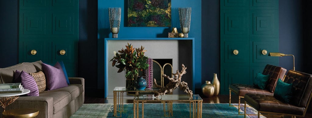
First things first, Noir.
Image from sherwin-williams.com
It is moody, melancholy and reminiscent of the Dutch Masters. Noir was influenced by Baroque and Romanticism; these periods of art embodied the freedom from rules, worship and nature. As a society, our reliance on technology makes us less connected with the universe. Noir helps us reconnect with the earth, celebrating the night. The stars are sparkling in the sky, and all the colors of the day have been mysteriously veiled by darkness.
The Noir palette is marked with characteristic names like Alchemy and Black Swan. It also includes the 2017 Color of the Year: Poised Taupe, a dusty lavender grey that adds a bit of light sophistication to an otherwise dark collection. There are a number of opulent finishes that relate to Noir: ornate damasks, overdyed rugs in jewel tones, iridescent finishes, veined marbles, agate stones, mercury glass, gilding and brushed brass. Noir is dramatic in all the best ways, and I would incorporate it into a place where you want to connect and reflect without the disrupting influence of light.
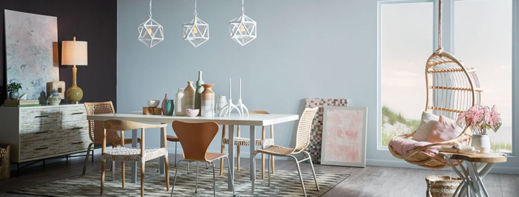
Now for something completely different, Holistic is the opposite of Noir as it embraces the light.
Image from sherwin-williams.com
It was inspired by the growing trends in sustainability, eco-tourism, and do-gooder social consciousness. Holistic has a wanderlust, and would be loved by adventurers who want to touch down and recharge. It celebrates the rugged nature of the outdoors by combining the colors of a mountain sunrise with natural textures and materials.
Some of the key players in this palette are light blues like Mountain Air and Stardew, and the triumphant return of clay-like corals such as Coral Island and Brandywine. Blend these modern neutrals with natural fibers, cane, suede, oxidized metals and raw wood edges for a style that is best described as “new nature”. Botanical transfer prints are back, as well as an exotic sketches on textiles. Diluted watercolor prints, powder pigment finishes and soft color tints on bulky furniture make Holistic focused on comfort. I think it is the perfect palette for your master bedroom, or any place you need to wind down at the end of your travels.
Read about the last two Colormix palettes in our next blog and learn which one speaks to you and your home design.
About the writer:


